


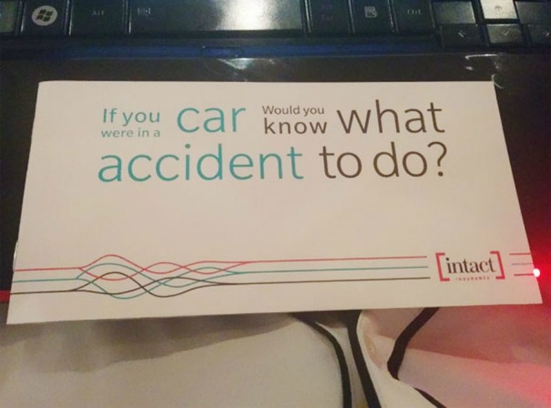
A Flawed Design
The people who designed this sign obviously didn’t think their color choice through. Although it’s a thoughtful message, it’s a poor execution because this message is lost. When driving past, you’re going to see a sign that says, ‘You Are Alone,’ which isn’t the message at all.
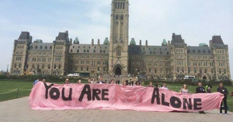
A Flawed Design
An Uncomfortable Look
We can only imagine what people thought when they were driving home and saw a giant face with an uncomfortable look staring down at them on a billboard. There are so many questions about what this sign is for, and we don’t have any answers.
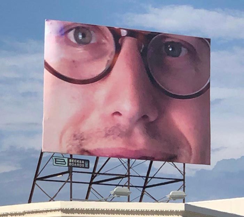
An Uncomfortable Look
We Must Do What?
There’s no doubt that this sign could lead to some traffic troubles, as it doesn’t seem to give any clear directions. We can only hope that this sign makes more sense to those in the area than it does to us.
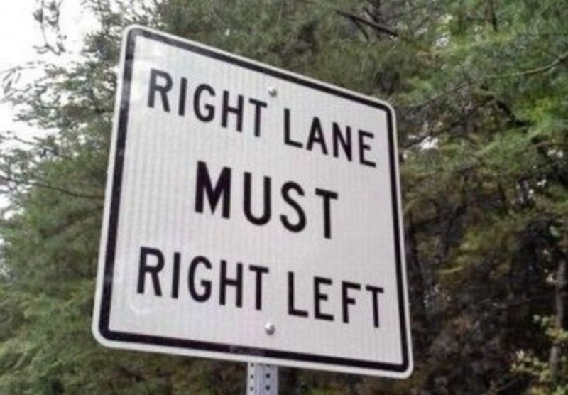
We Must Do What?
One Job
The purpose of drains being placed around the city streets is to collect rainwater. However, it seems as though the crew working on this drain didn’t get the memo because the drain is not placed correctly and can’t drain the rainwater like it’s supposed to.
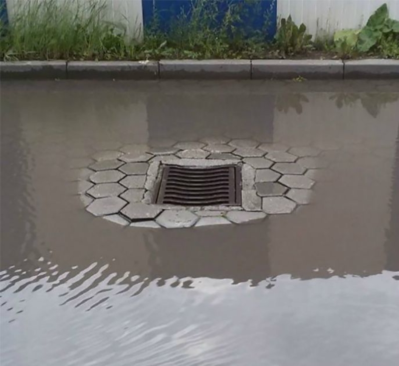
One Job
We Got It the First Time
This sign seems to be advertising Anna’s food mart. However, those behind this advertising really seem to want you to know that they are advertising a food mart, as they mention it twice. Nonetheless, we got the message sound and clear.
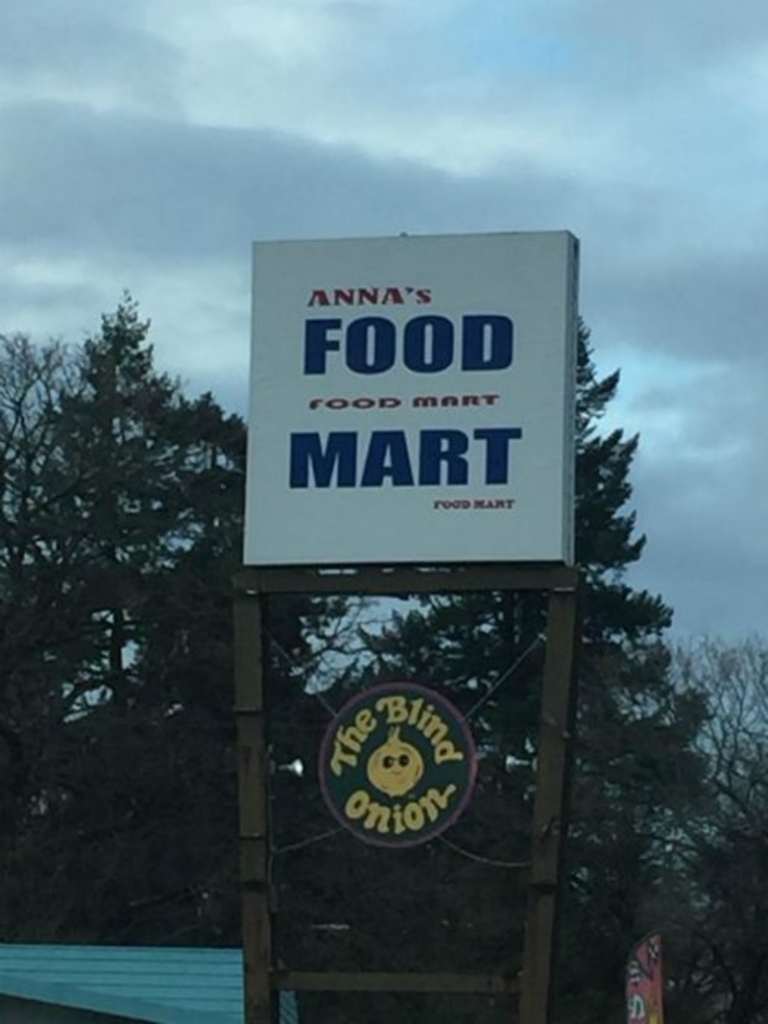
We Got It The First Time
A Bad Idea
This company has the best intentions to inform drivers about the dangers of not paying close attention when driving on the road. However, it seems as though this long paragraph is a little counterproductive. Texting and driving are no good, but neither is driving and reading.
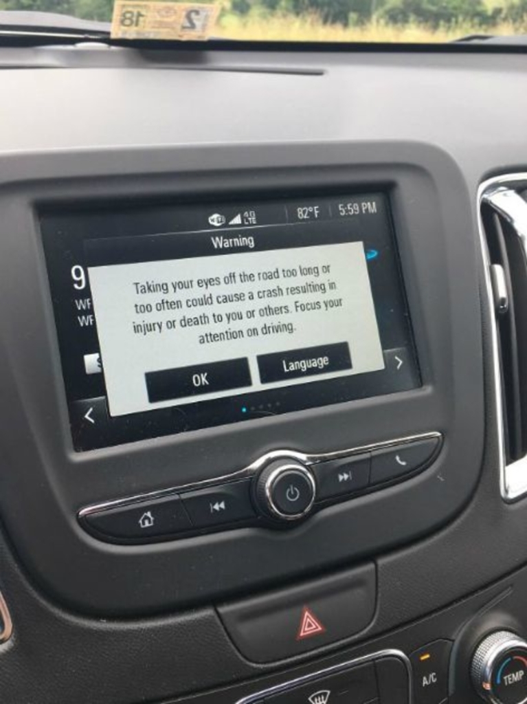
A Bad Idea
A Little Different
Paris is a well-known city that many tourists travel to, and one common thing to do is purchase a famous Paris souvenir to take with you when you go home. However, this Paris pillow seems to be missing the point and placed the Eiffel Tower on the ‘P’ instead of ‘A.’
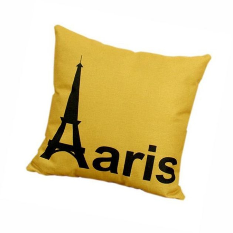
A Little Different
An Empty Customized Pillow
It seems that this customer didn’t get the memo when the company advertised this pillow as being customizable. Either that or they missed the box where they were supposed to type their own message. It’s definitely a missed opportunity that’s accidentally hilarious.
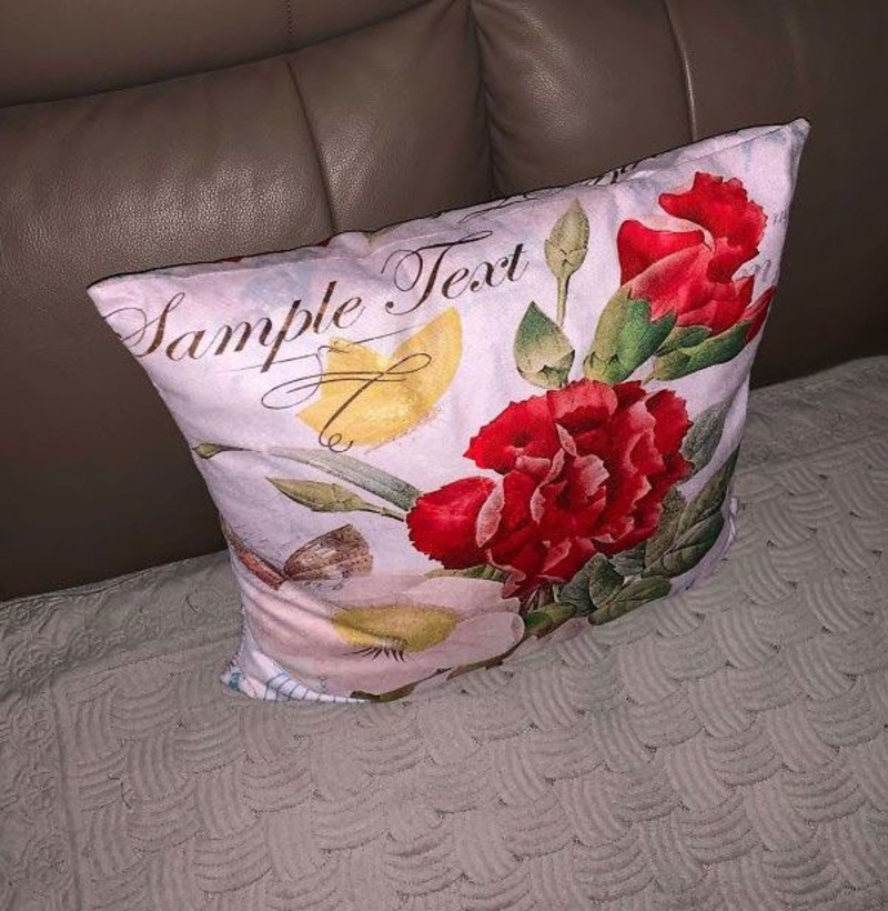
An Empty Customized Pillow
A Dirty Bathroom?
Your guests are likely to get a bit of a shock if they come into your bathroom and notice the brown smears decorating your countertops. It definitely looks like your bathroom hasn’t been cleaned, and we sure have many questions as to why someone chooses such a design.
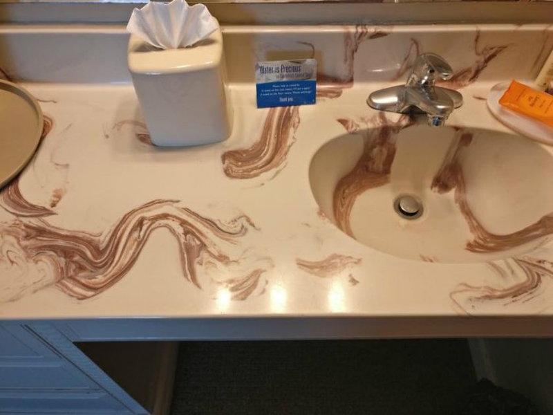
A Dirty Bathroom?
Not a Good First Impression
This definitely wasn’t planned out properly. The real problem comes in when you realize that this sign is advertising that the business can do the same thing for you, which isn’t what you want to see when looking for a window sign.
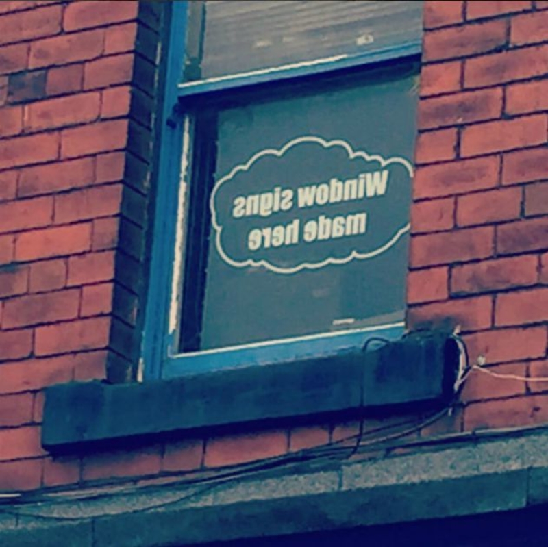
Not A Good First Impression
Good Intentions
Royal Dutch Airlines only had the best intentions when the airline decided to put together these rainbow-colored seatbelts to support for pride. However, those wearing the faulty belts might not have been too pleased, as they wouldn’t have been able to buckle in.
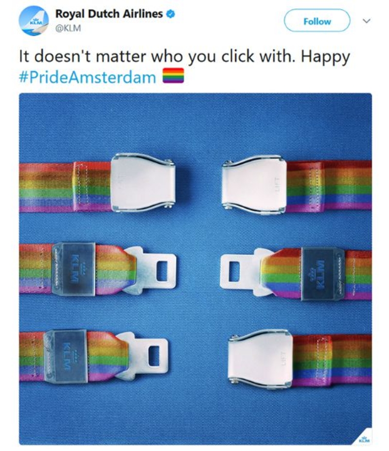
Good Intentions
A Little Dirty
If we were to see this toilet seat, we would most definitely keep moving to the next one at first glance. However, after closer inspection of this photo, we were very happy to see that the toilet was actually a clever design and optical illusion. Thank goodness!
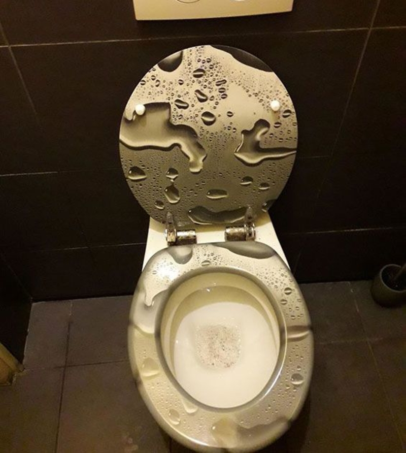
A Little Dirty
You Mean Click, Right?
Sometimes simplicity isn’t always the best option, but it isn’t, at least for this work uniform. In fact, this type of uniform may get someone arrested. What was meant to be ‘click’ has turned into a completely different word because the font has closely joined ‘c’ and ‘l.’
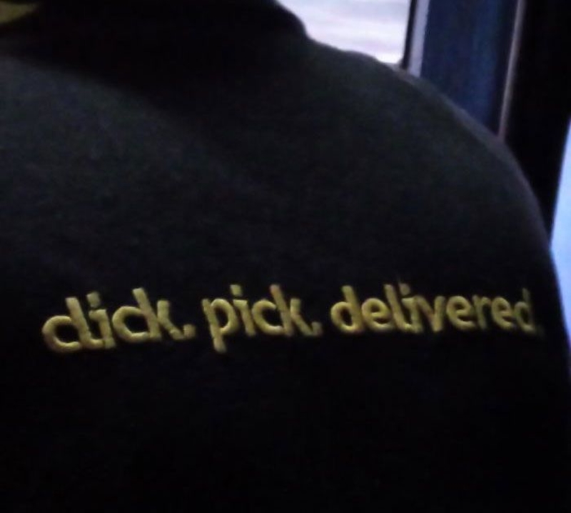
You Mean Click, Right?
Not the Same Effect
Rather than the business simply using a left hand alongside the right hand, the company decided to flip the image of the right hand. Not only is this very confusing to look at, but it’s also wrong and should not be used to teach people the difference between left and right.
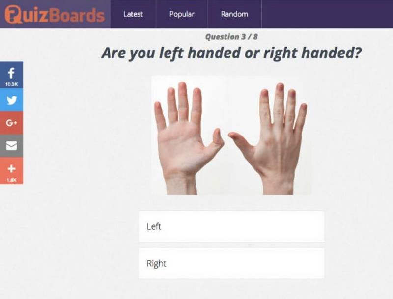
Not The Same Effect
What on Earth?
Not only is this a poor execution, but it also wasn’t the best idea in the first place. We are struggling to understand whether it’s a prank because that’s the only way such a thing makes sense. Otherwise, it’s just plain creepy.
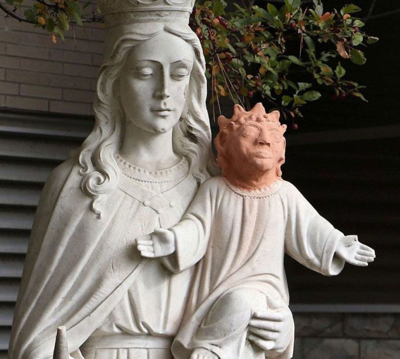
What On Earth?
Poor Practicality
In essence, this idea is very cute. The pillows light up with your significant other is sleeping on it. It’s definitely something you would expect to see in a Netflix show. However, this really isn’t a practical idea for when you decide to go to sleep.
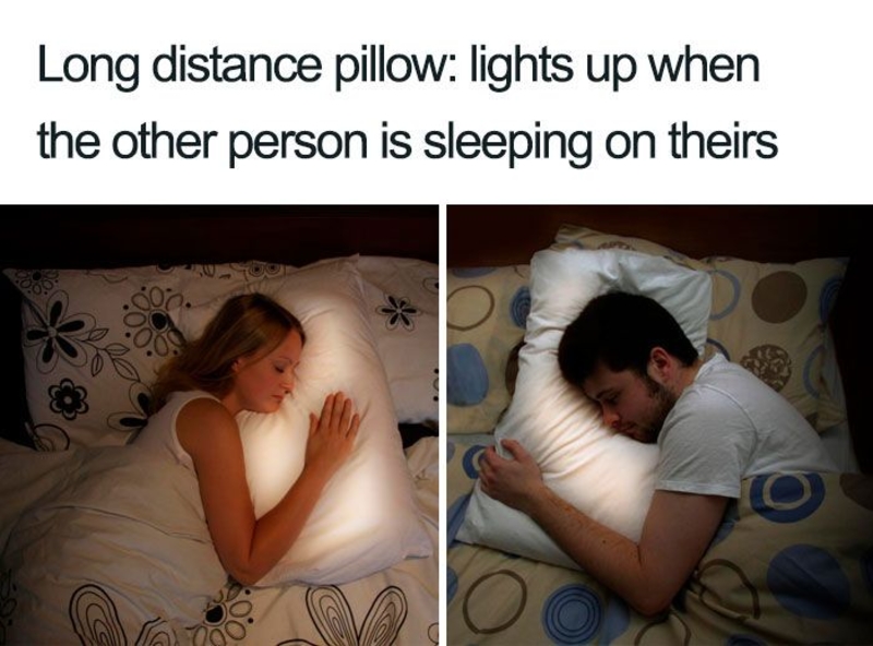
Poor Practicality
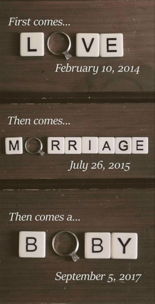
Morriage and Boby?
It’s clear that this couple didn’t think this through. We understand that the ring fits perfectly with ‘Love.’ However, unless the marriage is now being called ‘morriage’ and the couple plans to name their baby ‘boby,’ this doesn’t really make much sense.
Morriage And Boby?
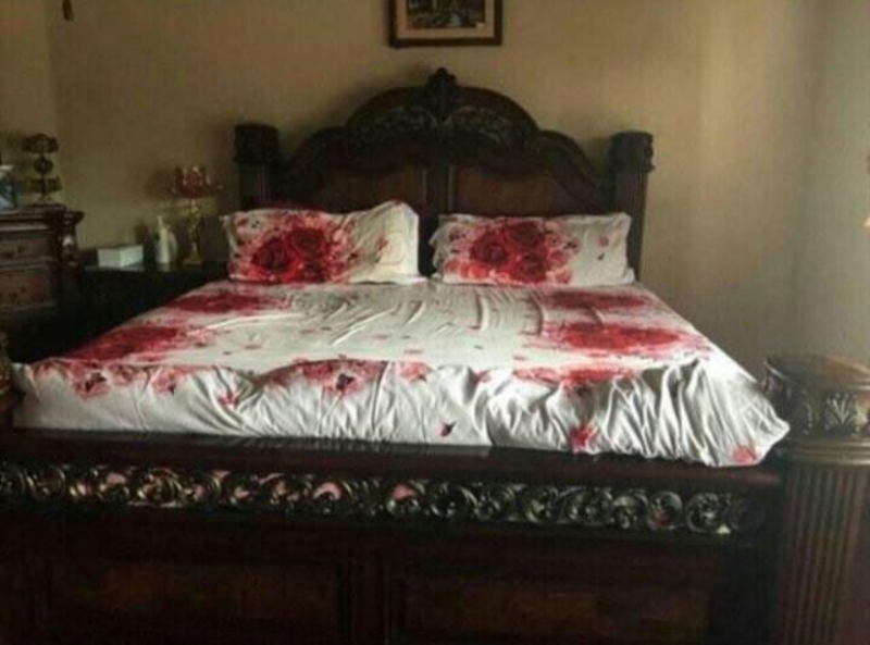
A Murder Scene
At first glance, this picture could be from a police crime investigation or a horror film. However, this may seem hard to believe, but the images on this bed are actually roses and not blood. Although, we still wouldn’t feel comfortable using the linen anyway.
A Murder Scene
Punctuation is Important
Either someone was too lazy to use any punctuation marks or wasn’t sure about how to go about it. Either way, there is a serious problem with this sign. The major problem is that the sign now reads as though the toilet is only for children who are disabled, elderly, and pregnant.
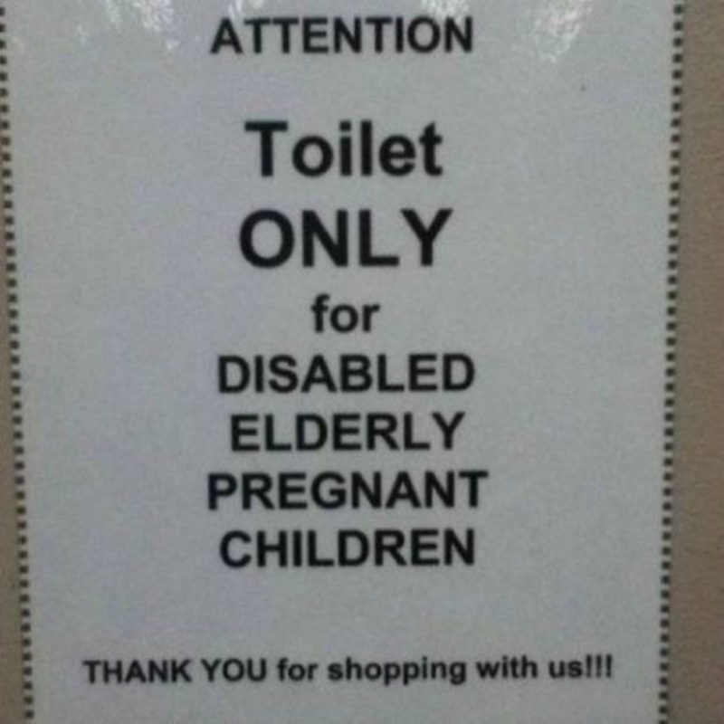
Punctuation Is Important
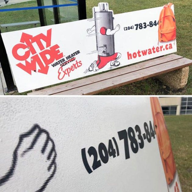
Defeating the Purpose
This image may show that the backpack is hiding the end of the business’s phone number. However, this business’s advertising team has purposely placed this backpack on the advertising, which makes this an epic marketing fail from the entire marketing team.
Defeating The Purpose
A Confusing Sight
This certainly is a confusing sight, but can you imagine entering this hotel elevator after a night of drinking. We can only imagine the confusion these holiday-makers are experiencing each time they enter this elevator and have the daunting task of finding their floor.
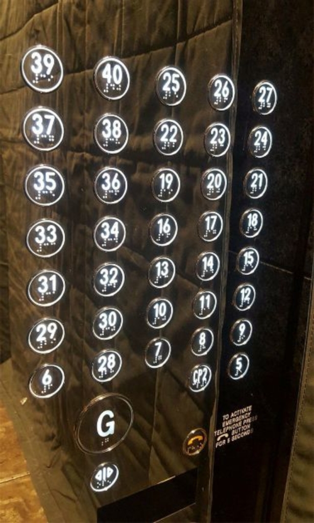
A Confusing Sight
Making it Obvious
This company did a great job of stating the obvious there. However, we are still stumbled as to why this business got to the place where the team wasn’t able ‘to connect to translator service’ when Google is the most popular search engine that holds the ability to translate anything.
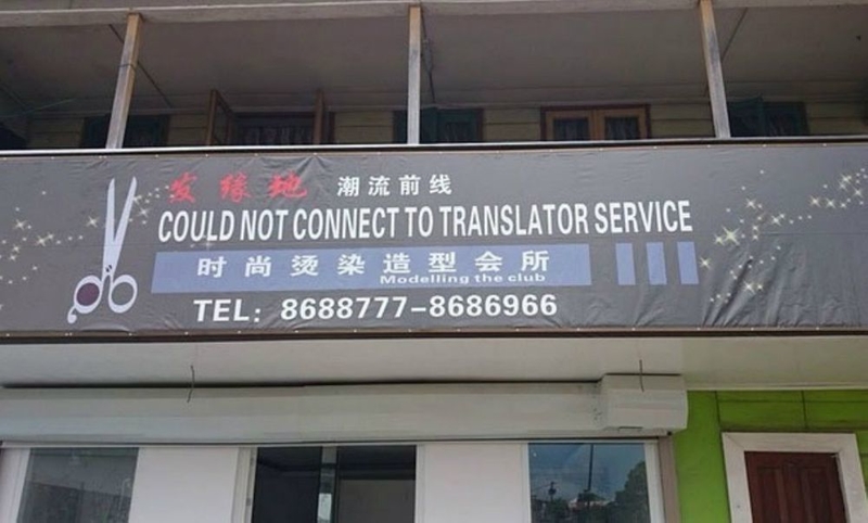
Making It Obvious
A Place for Everything
A classroom is known to offer a wide array of different subjects, but these classrooms all have similar facilities. However, we doubt that many students have seen a classroom with a toilet facing the first row of seats. This classroom is certainly a place for everything.
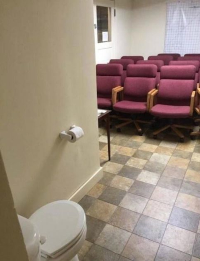
A Place For Everything
A Place to Meat
Many restaurants have outdoor seating that allows people to get together for a drink and meet. However, this restaurant took this too literally and incorporated furniture that looks like meat. It definitely is a great play on words, but it doesn’t look too appealing.

A Place To Meat
A Terrifying Image
Encouraging people to eat more potatoes isn’t a difficult thing, especially because potatoes are delicious. However, customers might not take too well to the vegetable after seeing the image that’s present on the packaging. It definitely is a terrifying image.
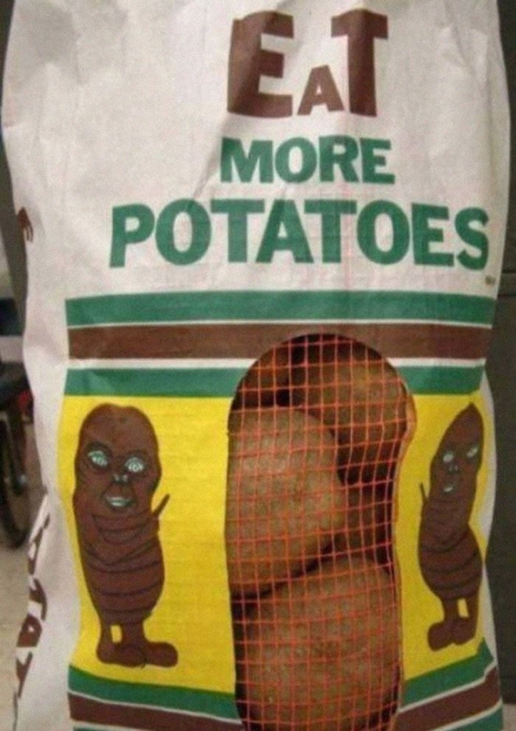
A Terrifying Image
A Baby Robot?
The signage on this bus seems to be advertising a robot baby. However, we know that this is only because of the unfortunate taillight replacing the baby’s eye. It definitely isn’t the best place to stick a picture of a baby.
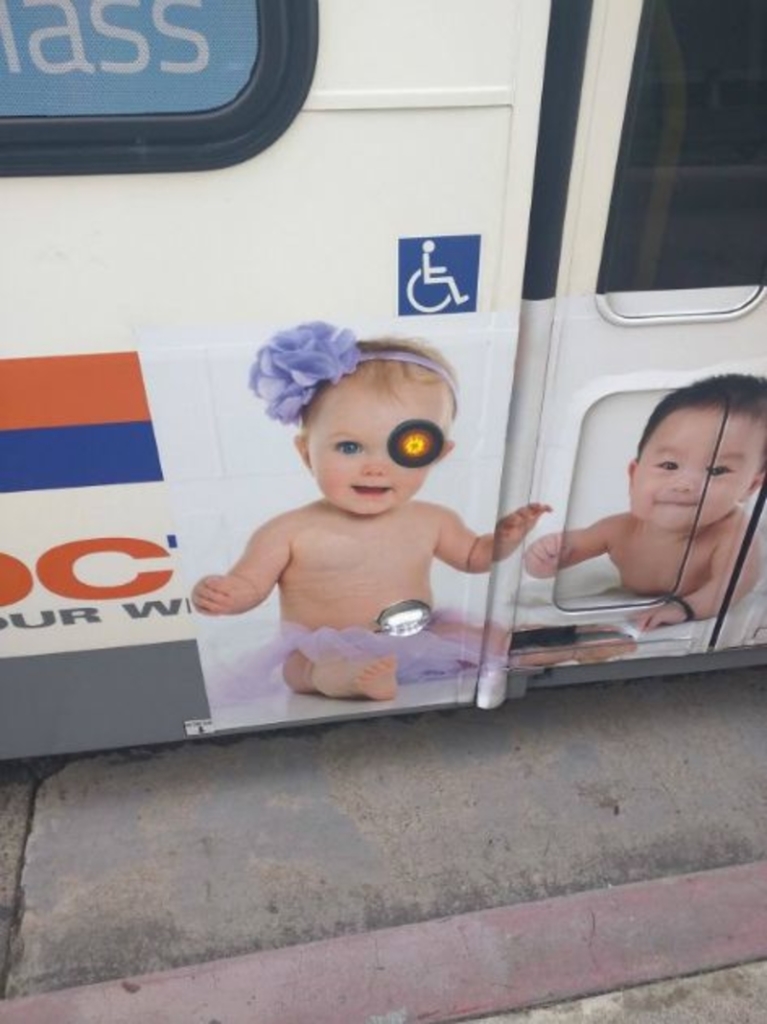
A Baby Robot?
Not Well-Thought-Out
This signage is yet another on this list that doesn’t seem to be well-thought-out in the slightest. When reading the sign normally, you’re going to notice that it states, “SASA LELE,’ rather than “SALE SALE.” Let’s hope the manager saw the problem before ending the sale.
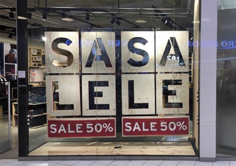
Not Well Thought Out
Was this Intentional?
After really looking at this picture, we have come to the conclusion that there’s no way that this signage wasn’t done on purpose. How could someone not plan to place a sign that looks like balls are shooting out of a hippo’s bottom? It seems pretty intentional to us.
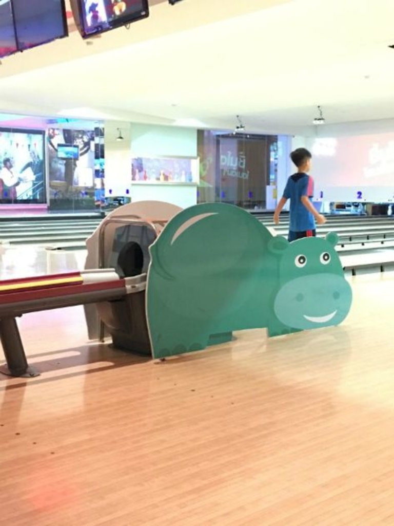
Was This Intentional?
Period Problems
Where people really trying to sell this skirt? There’s no doubt that a man wouldn’t have had a panic attack if he saw a woman wearing this, and we’re sure the ladies would have felt a particular way when seeing such an item.
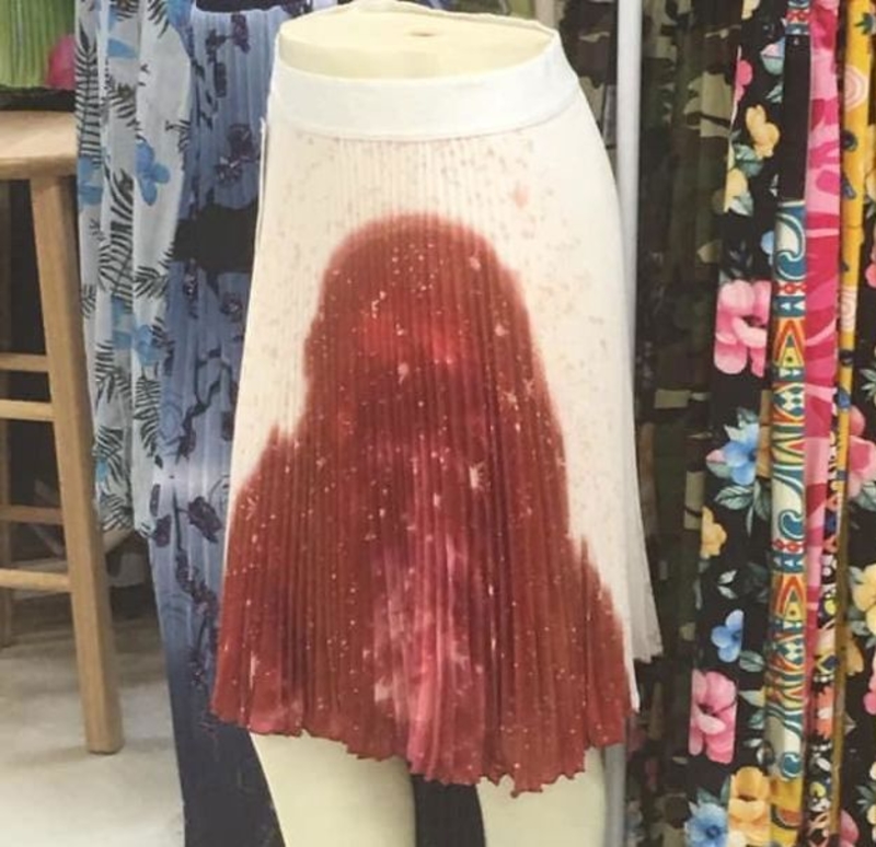
Period Problems
Teaching What You Know
We highly doubt that any sane person would buy this book, as it doesn’t look as though an expert on the topic has written the book. We don’t think an expert in graphic designing would release a book with such a dull and pointless cover.
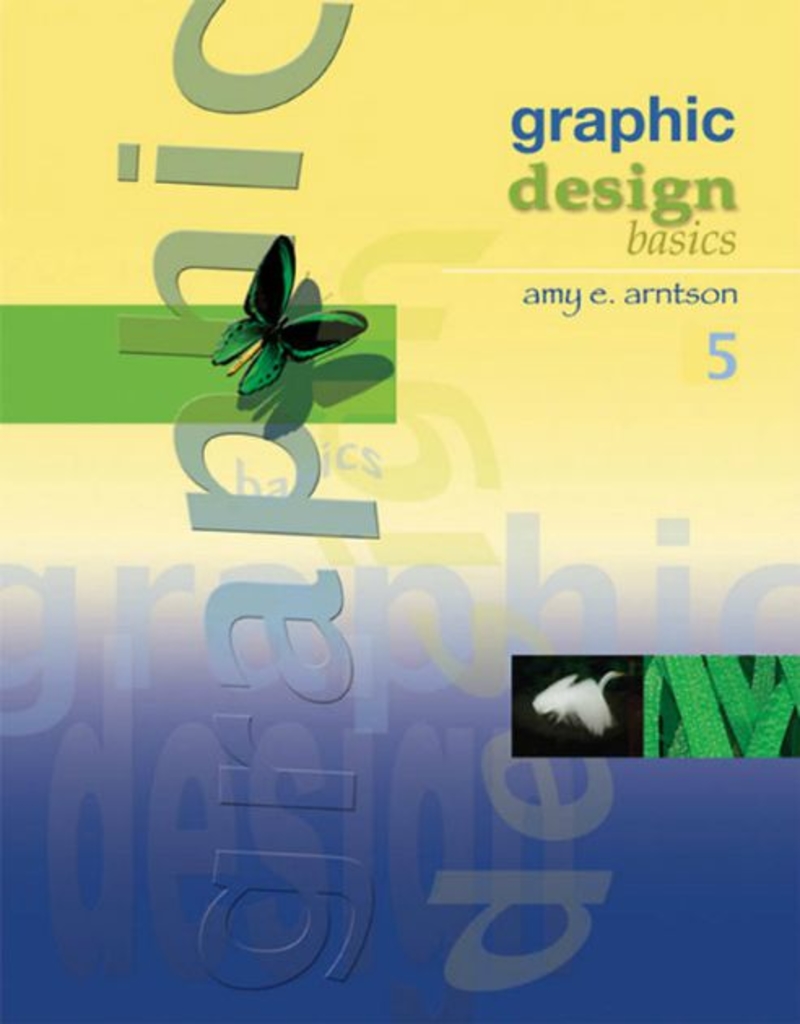
Teaching What You Know
A Problem with the Picture
This watch company clearly didn’t realize that the addition of animated hands wasn’t in proportion to the watches. We mean, why would this company choose to add small hands next to a picture of the watch. It makes the watches look a lot larger.
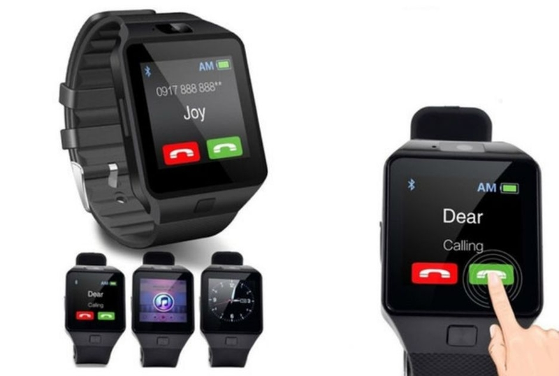
A Problem With The Picture
A Fashion Malfunction
There’s one massive flaw in the design of these anti-animal cruelty hoodies when placing the writing at the back of the hoodie. This is because the ‘anti’ part of the hoodie is completed covered when the hood is down, which portrays an entirely different type of club.
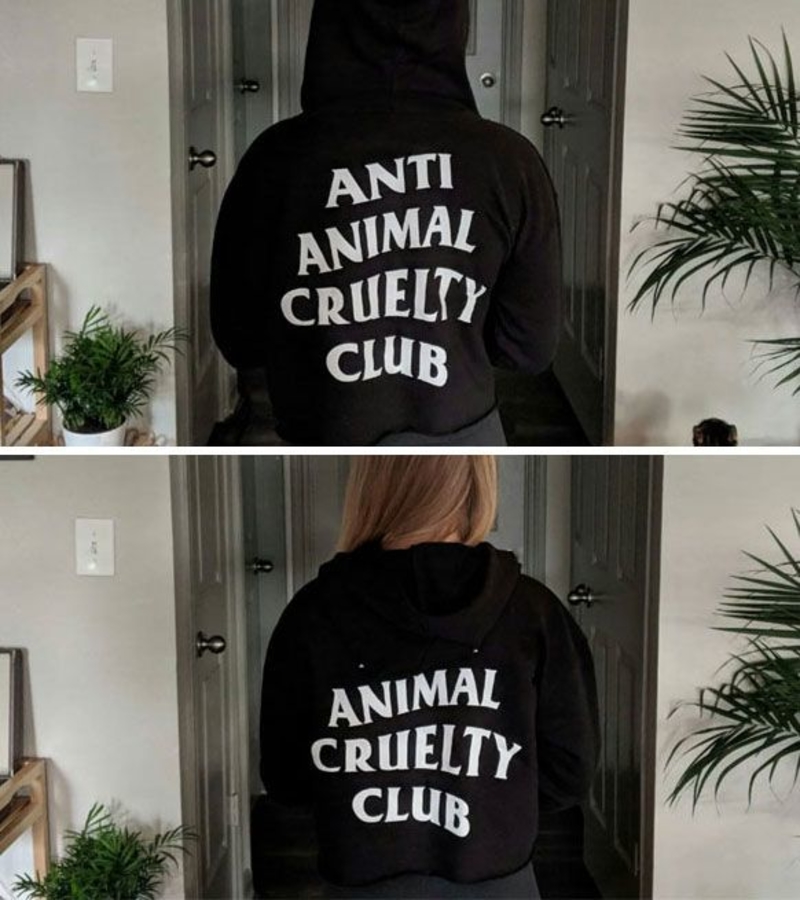
A Fashion Malfunction
But Allison
We completely understand what the sign was supposed to portray. However, it seems as though Allison wasn’t having any of it. It’s a clever play on words, and we can only imagine all the trouble that she went through to pull this off successfully.
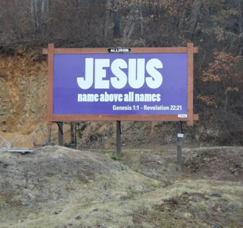
But Allison
Unfortunate Timing
This guy is unable to take part in the day being shown on the elevator and is sadly being left out of the activity while he spends his time waiting for an elevator. It’s either this or someone really picked the worst place for this signage.

Unfortunate Timing
Two Opposites
Picking the wrong bottle can easy change the way you wish to spend your night. Can you imagine wanting to have a relaxing night’s sleep and ending up having a colon cleanser? We definitely think the packaging could have been made a little different to help customers.
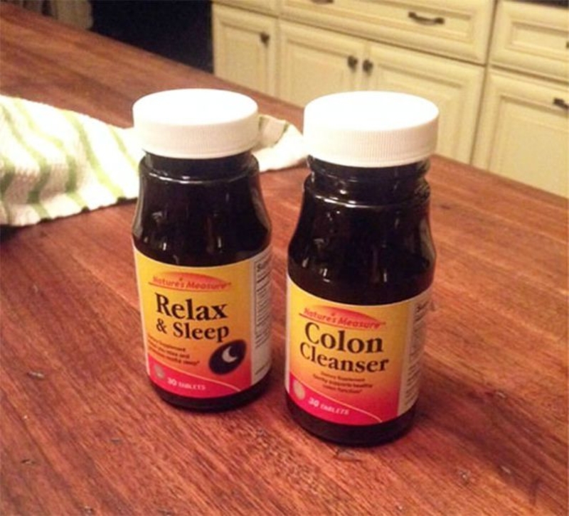
Two Opposites
What?
This is yet another sign that hasn’t taken into account the fact that the majority of people read from left to right. The business tried to use different colors to help readers, but we don’t see this being successful in what the marketing team was trying to accomplish.
What?
Bad Presentation
You would think that the entire process of packaging bread and getting it on the shelves would be long enough to spot any problems. However, this doesn’t seem to be the case for this brand, as the packaging leads many to believe that the bread has mold all over it.
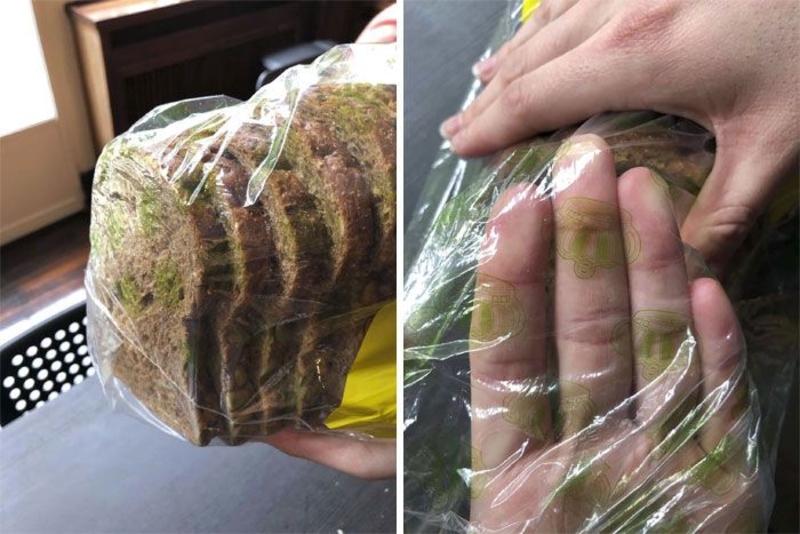
Bad Presentation
Safety Procedures
It’s always a good idea for your toddlers to wear a helmet when hammering a nail into a wall, but what about a nail that’s being hammered directly into the toddler’s thigh? Yes, we don’t think this is going to end well either, and we’re certainly happy that the advertisement ends there.
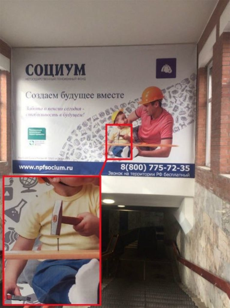
Safety Procedures
Naming Coffee
‘Coffee’ is one of those words that can be accompanied by nearly any name before it. However, there are just a few exceptions this this real. Although White Glass Coffee sounds like a great name, due to this unfortunate spacing, the name no longer reads as White Glass Coffee but something much less appealing.
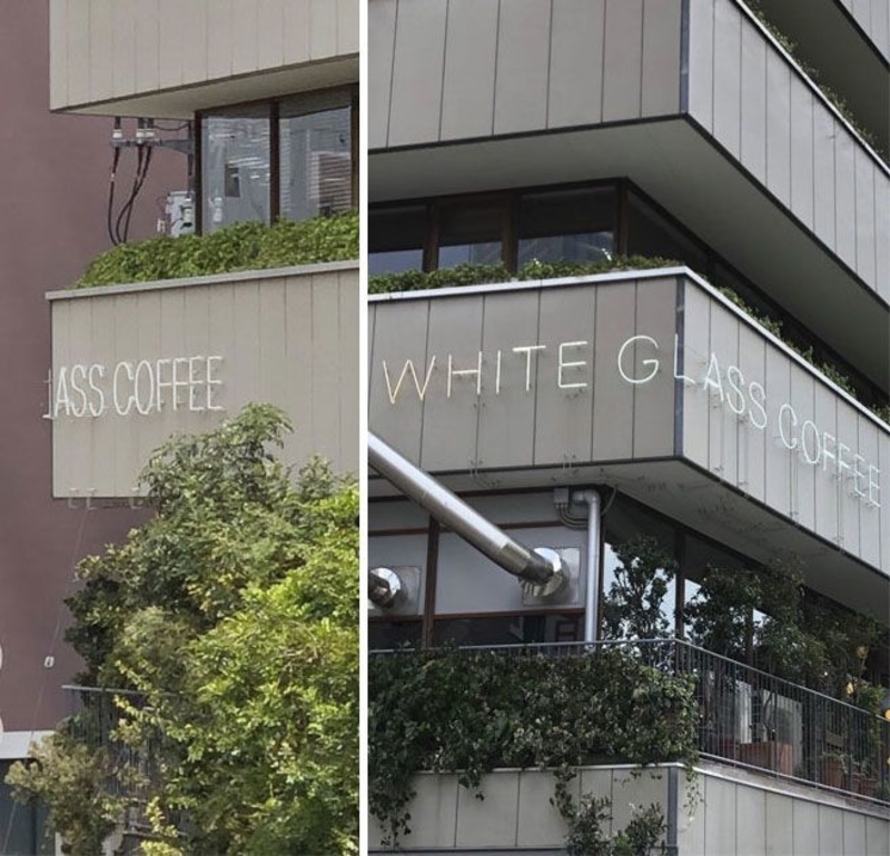
Naming Coffee
Dirty Dishes?
There seems to be a trend of developing designs that make it look as though items are dirty when these aren’t. These plates seem to look dirty, but that’s only the design of the dishes. Could the dishes have the same owner as the toilet and countertops on this list?
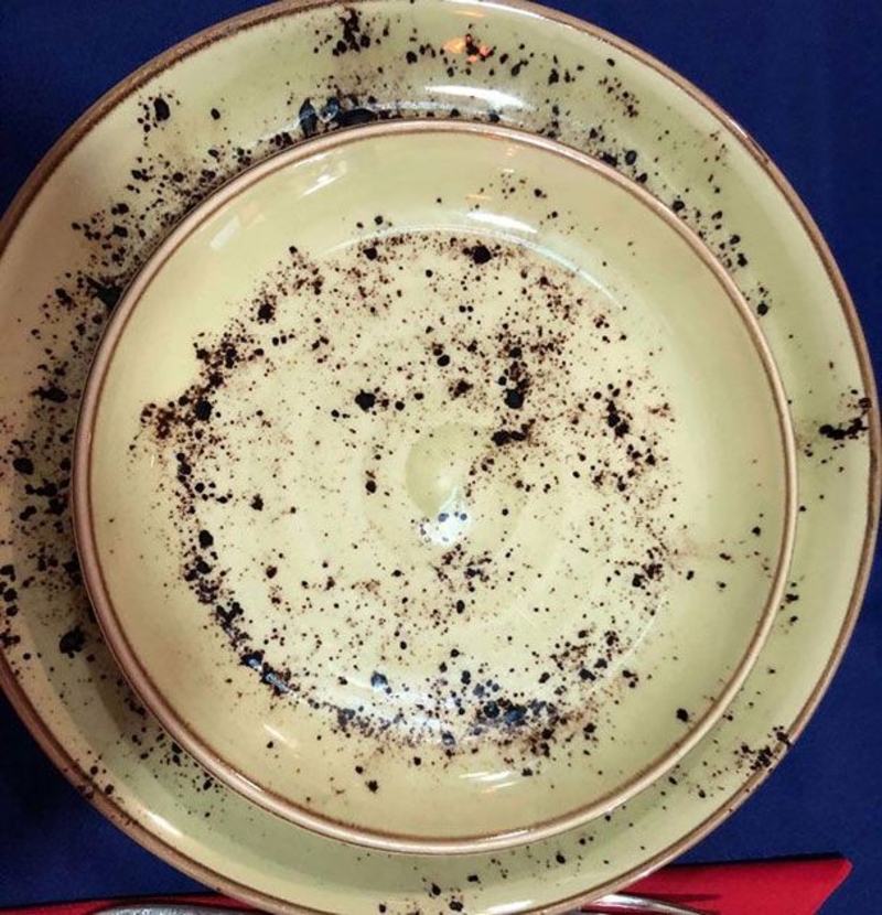
Dirty Dishes?